Icons are like magic. With a simple image, you can get to the essence, declutter slides, emphasise messages and use less text. Icons are everywhere: in publications like books and newspapers, in traffic, in public places, in the workplace and don’t forget the popular emoticons in messaging. So, even more reason to look further into the use of icons in elearning and presentations.
Let’s start with saying “I am not a graphic designer”. So, that’s out of the way.
Still, I do like my elearning modules and PowerPoint presentations to look pretty and easy to digest. Therefore, I use simple graphic design principles, preferably real-life photos to add context and, of course, icons.
Why you should use icons
There are different reasons and options to why or where you could use icons. It’s common knowledge that relevant pictures enhance the learning. Icons will help your learner to get down to the essence of the object or the concept without reading. They also make it easier to skim through a text. I’ll give you a short description as well as an example.1. To emphasise a message
Sometimes an icon says more than an image, or takes less space. It could emphasise the message without reading the text.
In this example on a text-heavy page, I chose to use an icon of a mallet to show the page is about disputes and breaching rules. I could have used an image of a court, but that would have added too much visual noise.
2. To replace text
Icons take less space than text. In some circumstances you would like to add information without adding more text. Icons also help you to declutter a slide. In this case I added icons for each person involved in the process. At the start of the module, the learner adds the name to the role and the icon with the name appears on every page about the process they’re involved in.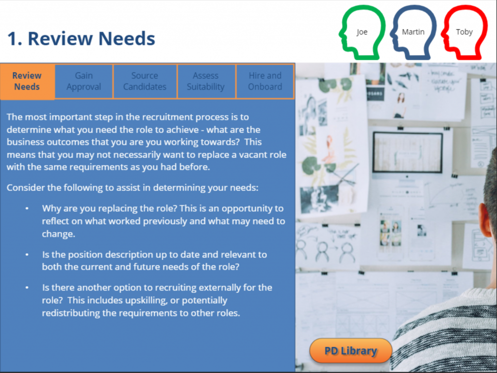
3. In bullet points
When you include icons in your bullet points, the learner will get a quick understanding of the content before reading the copy. It can also look more aesthetic than text only, e.g. I have used clickable icons with a single sentence as a summary, giving the option to go back to the content. This example shows my 2020 New Year’s learning resolutions in bullet points with limited text.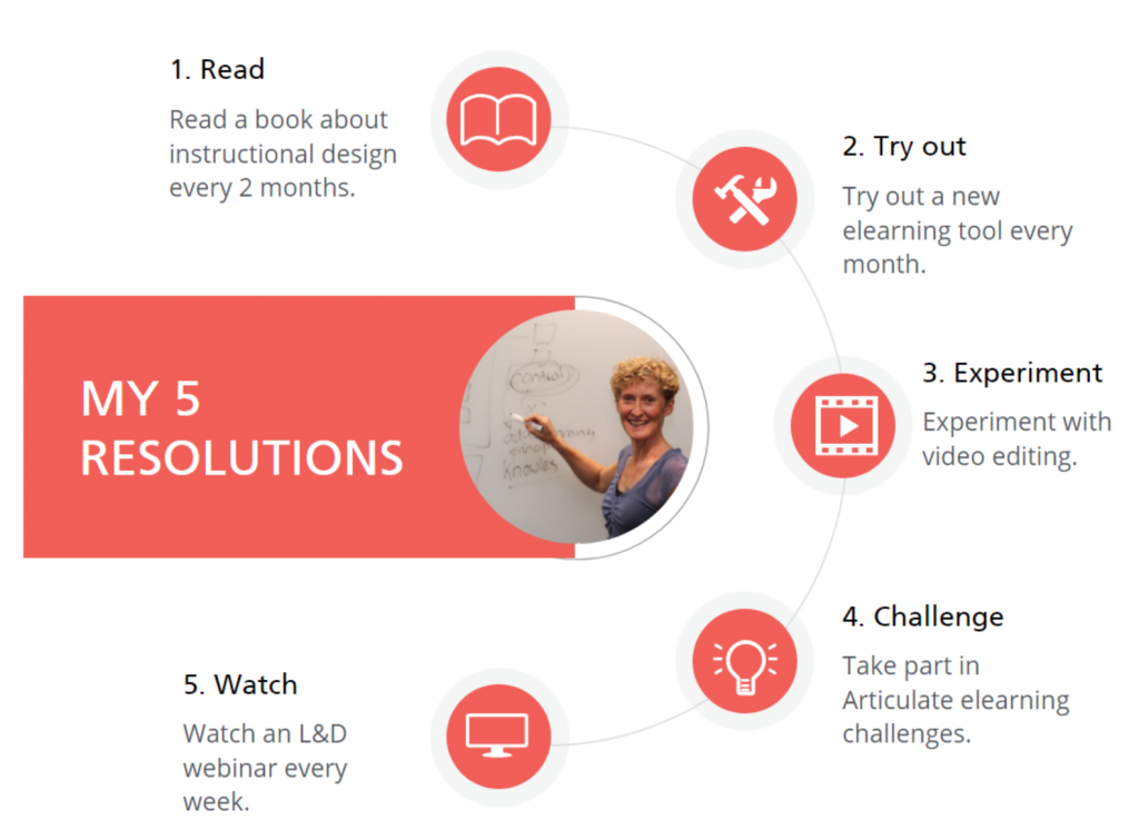
4. In your menu
Using icons in your menu will make the topic recognisable, especially when you let the icons return on the pages.
In this scene I used clickable icons representing process steps in a timeline that functions as a menu. After clicking on an icon, they see the simplified timeline at the top of each page. It shows on which page they are and which pages they’ve already visited.
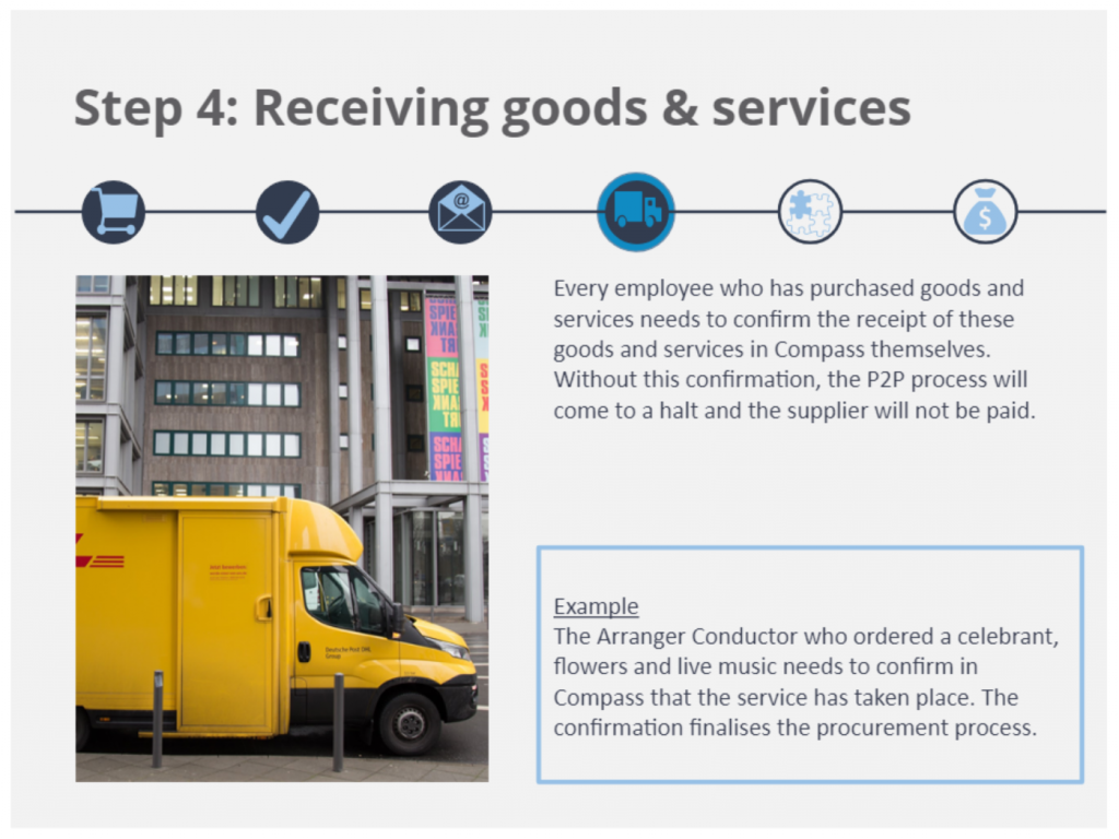
5. In an infographic
Infographics can’t do without icons. Less text, more visuals make infographics attractive. This example was part of an onboarding module: I combined an infographic style layout with a drag and drop activity to give the learner an understanding of the business size.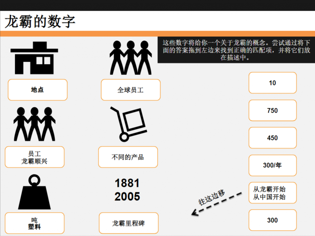
Icon types
There are different types of icons:
– Icons that are a pictorial representation of an object, e.g. male/female icons
– Icons that are a symbol or analogy, e.g. lightning strike for electrical hazard, home button in software
– Icons that show us an example of a situation, e.g. pedestrian crossing or trip hazard
Some icons have become common over time and we’re making the connection between the icon and the meaning without thinking. For example: traffic signs, icons on your computer, signage in public areas etc.
Icon styles
I made a quick infographic to show you the different icon styles. What works best, really depends on your other graphic design elements in the elearning module or presentation and how you want to use the icons. I prefer line icons and filled icons. The latter are easier to recognise. Both have simple lines that clearly convey the meaning of the icon. Personally, I am not a huge fan of the more detailed or flat icons with a shadow. They take more time to understand and that’s contradictory to the benefits of using icons.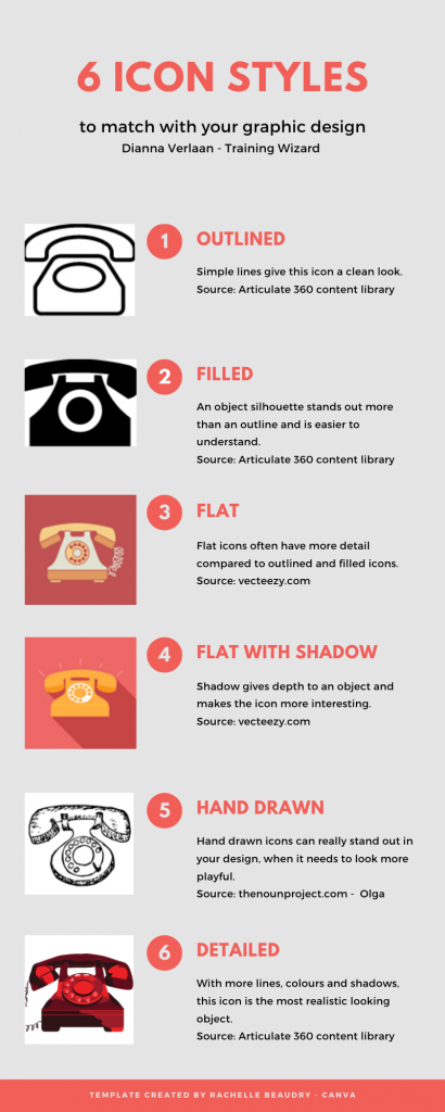
Icon resources
Articulate 360 has an icon library as well as PowerPoint. But when you’re looking for a different look, check out this blog with lots of resources.
You can also make your own icons, using photos for the outline of objects or the ‘merge shapes’ function in PowerPoint.
Icon tips
1. Try to use one style throughout your elearning course. I don’t mind using filled and line icons together, but don’t combine black and white flat icons with hand drawn and detailed coloured icons. It will look messy while the purpose is often to declutter.
2. Find clear symbols, so learners know immediately what it’s about. Google for icon keywords and you often see similar icons in the results. For example an exclamation mark or a pin when you’re googling ‘important’. That’s an indicator that the learner will understand your icon.
3. Make sure the icon is clickable (if needed in elearning), by grouping the image or using a hotspot. Otherwise the learner has to click on the lines or filled space and that’s not the best user experience
Icon ready?
I hope I gave you some ideas to use more icons in your next presentation or elearning module. I am sure you’ll notice more icons when you look for them. Do have a look at what’s available and try to find icons that are clear to the learner and match the style of your graphic design. Otherwise, you can always ask a graphic designer to make icons. Good luck!
